
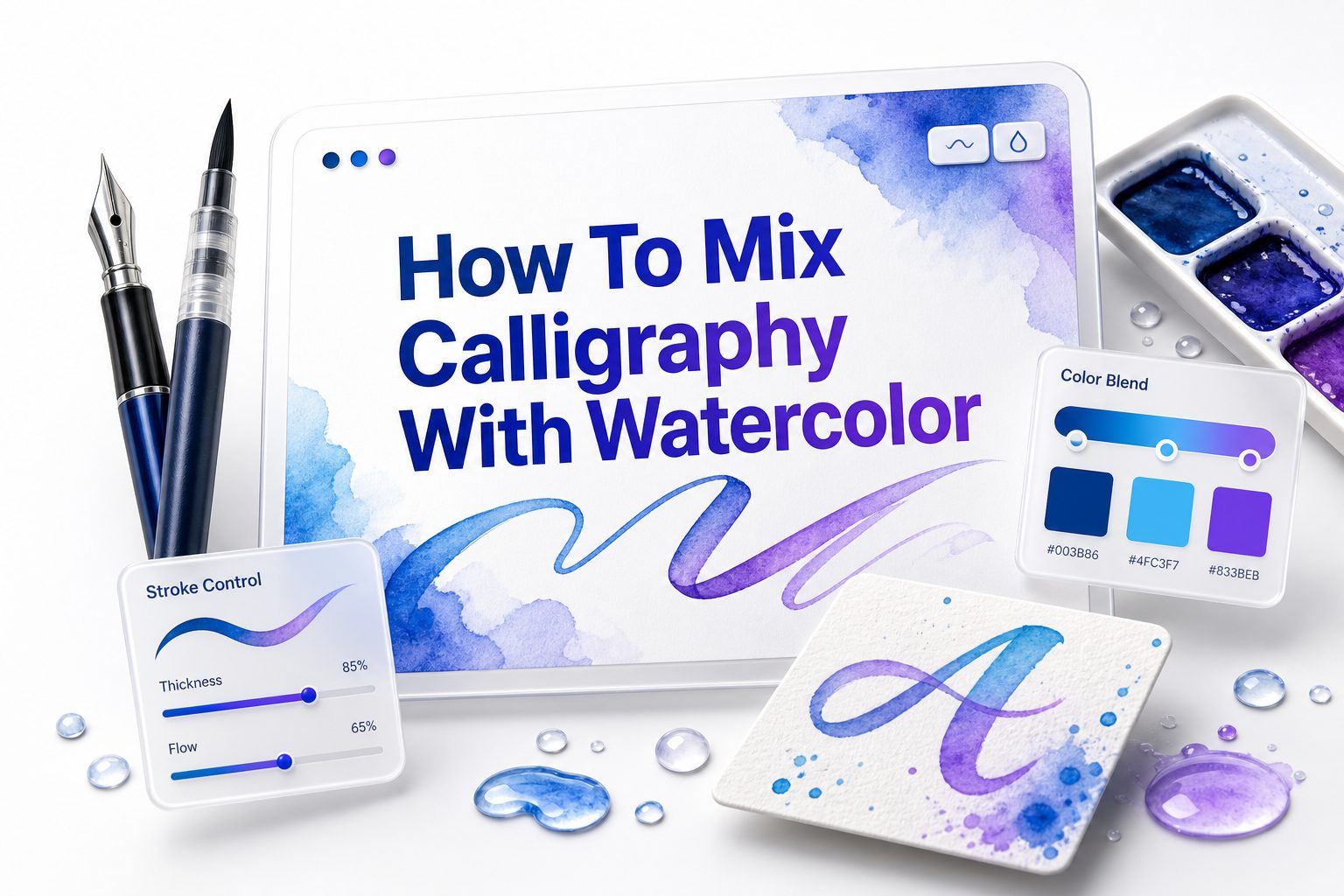
Watercolor and calligraphy have a natural relationship. One brings movement, softness, and color; the other adds structure, rhythm, and personality. When they work together, even a simple quote, greeting card, wedding sign, or journal page can feel thoughtful and refined. Learning how to mix calligraphy with watercolor is not about mastering every advanced technique at once. It begins with choosing compatible materials, giving each layer enough time to dry, and planning the balance between color and lettering.
Many beginners struggle because watercolor behaves loosely while calligraphy demands control. Paint spreads, paper buckles, and ink can bleed if the order of work is wrong. The good news is that these problems are easy to avoid with a few practical habits. This guide walks through tools, layouts, layering methods, color choices, and finishing details so your calligraphy and watercolor pieces look intentional rather than accidental.
Choosing the Right Paper for Watercolor Calligraphy
Paper affects every part of the process, especially when water and ink share the same surface. Standard printer paper usually warps, pills, or causes lettering ink to feather. A good watercolor paper gives paint room to flow while keeping calligraphy strokes crisp after drying.
Cold press watercolor paper is a popular choice because it has texture without being too rough. Hot press paper is smoother and often better for pointed pen calligraphy or brush lettering. If your lettering style uses delicate hairlines, test the nib or pen before starting the final artwork.
Selecting Paints, Inks, and Lettering Tools
Watercolor pans, tubes, and liquid watercolors can all work well with calligraphy. Artist-grade paints usually give stronger pigment and cleaner mixing, but student-grade sets are fine for practice. What matters most is learning how much water your paper can handle before the surface becomes fragile.
For lettering, waterproof ink is safest when calligraphy goes down before watercolor. If the watercolor layer comes first, make sure it is fully dry before adding ink. Brush pens, dip pens, pointed nibs, and small round brushes can all create beautiful lettering effects depending on your style.
Essential Supplies Checklist
- Watercolor paper, preferably 140 lb or heavier
- Watercolor paints in a limited palette
- Waterproof black or colored ink
- Brush pens, pointed pens, or small round brushes
- Two water jars, one clean and one for rinsing
- Paper towels or cotton cloth
- Pencil and soft eraser for light guidelines
- Masking tape or low-tack artist tape
- Scrap paper for testing color and ink flow
- Heat tool or patience for complete drying
Planning Your Composition Before Painting
A strong watercolor calligraphy piece usually starts with layout planning. Decide where the lettering will sit, how large it should be, and where color will support the message. A quick pencil thumbnail can prevent crowded spacing, awkward margins, and distracting paint placement.
Think of watercolor as atmosphere and calligraphy as the focal point. The painted areas should guide the eye toward the words, not compete with them. Light washes, soft borders, florals, wreaths, and abstract shapes are useful because they add interest without overpowering the lettering.
Choosing the Best Order of Layers
The safest order is often watercolor first, calligraphy second. This approach keeps lettering sharp because the ink is applied to a dry painted surface. It also lets you adjust the color background before committing to the final words.
Calligraphy first can work when using waterproof ink and a gentle wash over the top. This creates a softer, integrated look, but it requires more testing. Some inks claim to be waterproof yet still smear under heavy brushing, so always test the exact paper, ink, and paint combination.
Layering Order Comparison
Method | Best For | Main Risk | Helpful Tip
Watercolor first | Quotes, cards, wall art | Ink skipping on textured paper | Let paint dry completely before lettering
Calligraphy first | Soft vintage effects | Ink bleeding or smearing | Use waterproof ink and test it first
Mixed layers | Florals, borders, illustrated pieces | Muddy colors or crowded design | Work slowly and dry between layers
Masking first | White lettering effects | Torn paper when removed | Use low-tack masking fluid or tape carefully
Creating Soft Watercolor Backgrounds
Soft backgrounds are one of the easiest ways to mix paint and lettering. Start with clean water on the paper, then touch in diluted color and let it spread naturally. Keep the center lighter if your calligraphy will sit over the wash.
Avoid overworking the paint once it begins drying. Repeated brushing can create harsh marks, damaged paper, and muddy color. If you want more depth, let the first wash dry fully, then add a second transparent layer around the edges.
Adding Calligraphy Over Watercolor Washes
Before lettering over a wash, check that the paper feels completely dry and cool. Damp paper can cause feathering, even with good ink. If the surface has buckled, place the dry sheet under a heavy book overnight before adding detailed calligraphy.
Use a light pencil guide if alignment matters. For brush lettering, move slowly across textured paper so the pen tip does not catch. For pointed pen work, avoid pressing too hard because watercolor paper fibers can grab the nib and interrupt smooth strokes.
Practical Tips for Cleaner Lettering
- Test every ink and paper pairing before the final piece.
- Keep watercolor areas lighter behind thin calligraphy strokes.
- Use darker lettering over pale washes for better readability.
- Let each painted layer dry before adding another medium.
- Place a clean sheet under your hand to avoid smudges.
- Avoid heavy erasing over watercolor because it can lift pigment.
- Scan or photograph finished work before framing or mailing.
Using Color Theory in Watercolor Calligraphy
Color choice can make the difference between elegant and cluttered artwork. A limited palette often looks more polished than a page filled with unrelated colors. Two or three harmonious shades are usually enough for backgrounds, florals, shadows, and small decorative accents.
Pair warm lettering with cool washes, or use deep ink against soft pastel paint. Gold, navy, burgundy, forest green, and charcoal often work beautifully with watercolor. For romantic pieces, try blush, dusty blue, sage, and muted lavender without making every element equally saturated.
Building Florals and Botanical Accents
Loose watercolor florals pair well with calligraphy because they bring softness around structured letters. Begin with simple petal shapes, leaves, and stems rather than complex botanical detail. Keep the strongest color near corners, borders, or selected words so the design feels balanced.
Leave enough breathing room around the lettering. Florals that touch every letter can make the artwork hard to read. A better approach is to frame the words with clusters, vines, or small scattered leaves while keeping the main message clear and easy to scan.
Simple Floral Layout Ideas
- Corner clusters around a short quote
- A half wreath around names or initials
- Small leaves following a curved baseline
- Loose flowers framing a wedding date
- Pale petals behind bold black lettering
- Greenery borders along the top and bottom
- Tiny accent blooms near emphasized words
Combining Brush Lettering with Watercolor Effects
Brush lettering is one of the most approachable ways to blend calligraphy with watercolor. You can use watercolor directly on a round brush to form letters, or load a water-based brush pen with blended color. This creates natural variation within each stroke.
For stronger contrast, letter with a brush pen after painting the background. If you want ombre lettering, touch a darker pigment to the bottom of a wet letter and let it rise slightly. Work one word at a time so the color stays active enough to blend.
Working with Dip Pens and Pointed Nibs
Pointed pen calligraphy gives watercolor artwork a refined, traditional look. Smooth hot press paper often works best because textured paper can catch the nib. If you prefer cold press paper, choose a finer texture and test how the nib moves before starting.
Use a light touch and steady ink flow. Thick watercolor layers can create uneven surfaces, so avoid placing pointed pen lettering over heavily textured paint. If the nib skips, try a smoother paper, a different ink, or a slightly simpler lettering style.
Common Mistakes to Avoid
Mistake | Why It Happens | Better Approach
Lettering on damp paint | Impatience during drying | Wait longer than you think is necessary
Using too much water | Weak paper or overloading brush | Build color in thin layers
Crowded decoration | Too many accents near words | Leave clear space around lettering
Poor contrast | Similar ink and wash values | Use dark ink on light paint
Skipping tests | Materials react differently | Make a small sample first
Creating White Lettering with Masking Techniques
White lettering can look striking against watercolor, especially for night skies, deep florals, and bold washes. Masking fluid lets you preserve white paper before painting. Apply it carefully with an old brush, ruling pen, or silicone tool because it can damage good brushes.
Once the masking fluid is completely dry, paint over it with watercolor. Remove it only after the paint has dried fully. Pull gently with clean fingers or a rubber cement pickup, and avoid using this method on fragile paper that tears easily.
Using Metallic Accents Tastefully
Metallic watercolor, gold ink, or shimmer paint can add elegance when used sparingly. A thin gold shadow, small stars, leaf veins, or a few border details can lift the whole piece. Too much shine can distract from the message and make the artwork look busy.
Metallics show best on darker colors or clean white space. Let regular watercolor dry first, then add shimmer as a final layer. If you use metallic ink for calligraphy, stir it often because pigment settles quickly and can create uneven strokes.
Best Uses for Metallic Details
- Gold dots around floral clusters
- Thin shadows on large brush letters
- Metallic names on wedding stationery
- Small stars over a dark blue wash
- Leaf veins on botanical artwork
- Borders around place cards
- Highlight strokes on important words
Designing Quote Art and Greeting Cards
Quote art works best when the words are easy to read from a short distance. Choose one focal phrase, then make supporting words smaller. Watercolor can emphasize emotion through color, but the lettering hierarchy should carry the message clearly.
Greeting cards give you less space, so simplify the design. A loose wash, one strong lettering style, and a few painted accents are often enough. For birthdays, weddings, thank-you cards, or seasonal notes, match the colors to the occasion without overcrowding the page.
Making Wedding and Event Stationery
Watercolor calligraphy is popular for invitations, place cards, menus, and envelope addressing because it feels personal and refined. Soft washes can match a wedding palette, while calligraphy adds formality. Consistency matters more than complexity when creating several pieces for one event.
Create a sample style sheet before making a full set. Note the paper, paint colors, ink, lettering size, and spacing. This keeps each piece looking related, especially when handmade variations naturally appear across place cards or envelopes.
Stationery Project Ideas
- Watercolor envelope liners with calligraphy addresses
- Place cards with soft color washes
- Menu headers in pointed pen calligraphy
- Invitation borders with loose florals
- Table numbers with large brush lettering
- Thank-you cards with painted initials
- Vow book covers with metallic accents
Fixing Bleeds, Smudges, and Uneven Paint
Small mistakes do not always mean starting over. A tiny ink skip can be corrected with a fine brush or matching pen. Pale watercolor blooms can become part of the design if you add another transparent layer or balance them with similar marks elsewhere.
For smudges, wait until everything dries before deciding what to do. Wet corrections often make problems worse. You can sometimes cover a mark with a floral accent, darker wash, paper overlay, or carefully placed embellishment that still fits the original composition.
Practicing with Small Projects First
Large finished pieces can feel intimidating, so start small. Practice on bookmarks, gift tags, mini cards, and swatch sheets. These projects let you test color, lettering, and spacing without wasting expensive paper or feeling pressured to create a perfect final artwork.
Keep a practice log with notes about what worked. Write down ink names, paper type, drying time, and color mixes. Over time, these notes become more useful than random practice because they help you repeat successful effects with confidence.
Beginner Practice Projects
- One-word watercolor bookmarks
- Thank-you tags with loose leaves
- Small quote cards with pale washes
- Initial monograms with floral accents
- Envelope name samples
- Color swatches with lettering tests
- Mini wreath designs around short names
Scanning and Preserving Finished Artwork
Finished watercolor calligraphy should be protected from moisture, direct sunlight, and rough handling. Use archival sleeves, acid-free mats, or quality frames if the piece is meant to last. Watercolor pigments can fade over time, especially when displayed in bright light.
If you plan to print or share your work, scan it at high resolution before framing. A clean scan also lets you create cards, prints, or portfolio images. For more creative process ideas, visit [Internal Link: watercolor lettering techniques] from our main website.
Turning Practice into a Personal Style
Personal style develops through repeated choices, not sudden perfection. Notice which colors, lettering forms, layouts, and subjects you return to most often. Some artists love airy florals and thin scripts, while others prefer bold brush lettering over expressive washes.
Study your finished pieces and remove what feels unnecessary. Strong style often comes from restraint: fewer colors, clearer spacing, and consistent letterforms. For more lettering foundations, see [Internal Link: beginner calligraphy practice guide] from our main website.
Conclusion
Mixing watercolor and calligraphy is a practical skill built on timing, material testing, and thoughtful design. The paint can be loose and expressive, but the lettering needs a stable surface, strong contrast, and enough space to breathe. When those basics are in place, even simple artwork begins to look polished.
Start with reliable paper, a small palette, and ink that suits your layering order. Practice backgrounds, florals, metallic touches, and lettering styles on small projects before moving into finished quote art, cards, or stationery. The more you test your materials, the fewer surprises you will face on final pieces.
Learning how to mix calligraphy with watercolor is less about copying a perfect formula and more about building judgment. With patience, clean layers, and careful composition, you can create artwork that feels personal, elegant, and genuinely handmade.
FAQ
Can I use watercolor paint for calligraphy
Yes, watercolor can be used for calligraphy with a brush or refillable brush pen. It creates soft color variation, but it may look lighter than ink. Use enough pigment and practice controlling water for readable strokes.
Should watercolor or calligraphy come first ?
Watercolor usually comes first because dry paint gives you a safer surface for crisp lettering. Calligraphy can come first only when using fully waterproof ink. Always test the exact materials before working on a final piece.
What paper is best for watercolor calligraphy ?
Hot press watercolor paper is best for smooth calligraphy, especially with pointed pens. Cold press paper works well for brush lettering and loose styles. Choose 140 lb paper or heavier to reduce buckling and surface damage.
How do I stop ink from bleeding ?
Let watercolor dry completely before lettering, and use quality paper that handles wet media. Bleeding often happens on damp, thin, or overly absorbent paper. Waterproof ink and light pencil guidelines can also improve control.
Can beginners mix calligraphy with watercolor ?
Beginners can start with simple washes, short words, and small cards. The key is practicing one skill at a time before combining them. Begin with pale backgrounds and dark lettering for clean, readable results.
0 Comments